PACKAGING – Black Opium Coffee

Created for Coffee Addicts

DESIGN BRIEF:
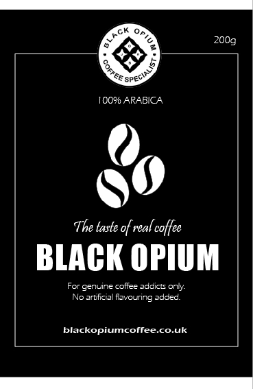
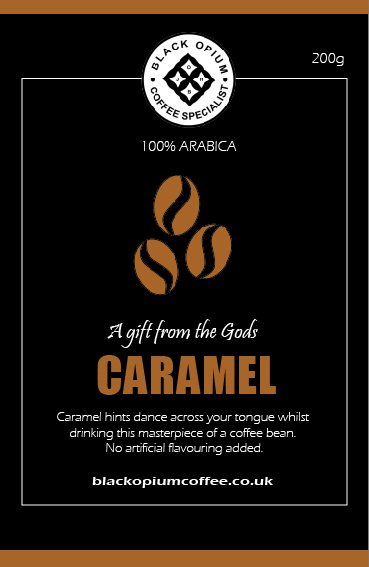
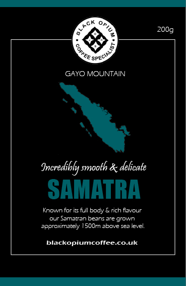
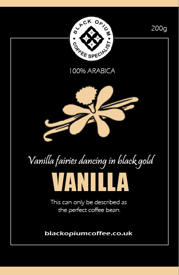
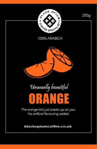
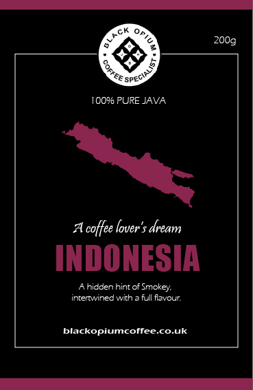
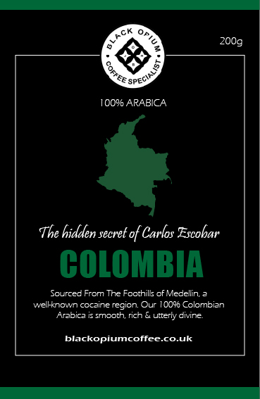
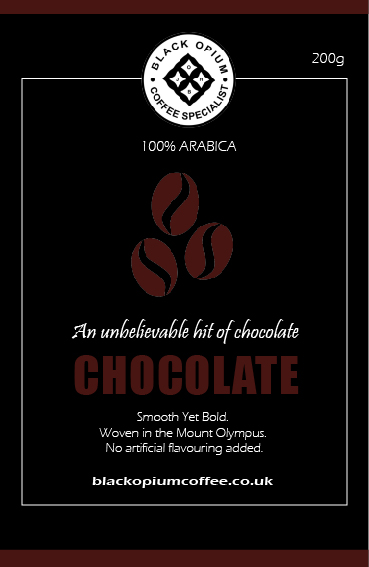
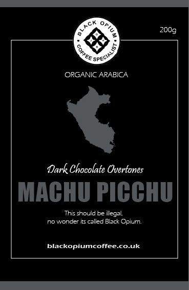
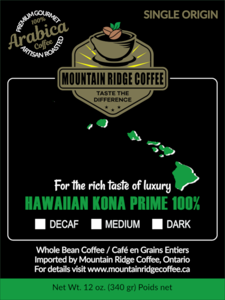
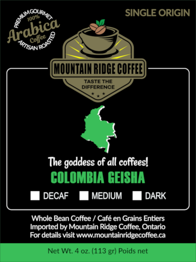
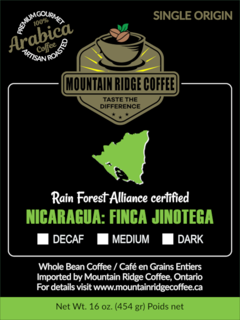
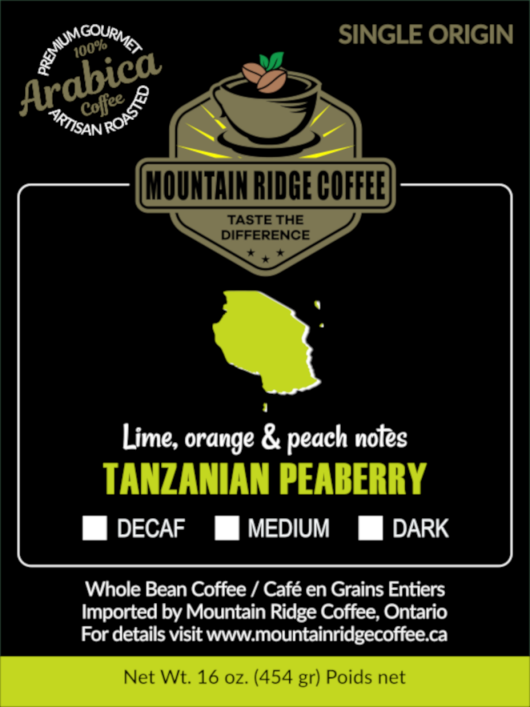
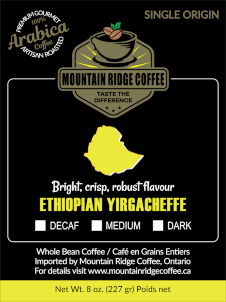
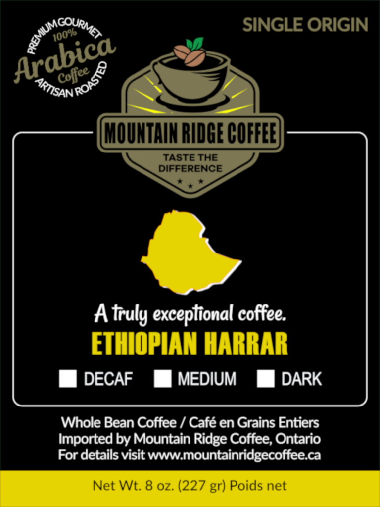
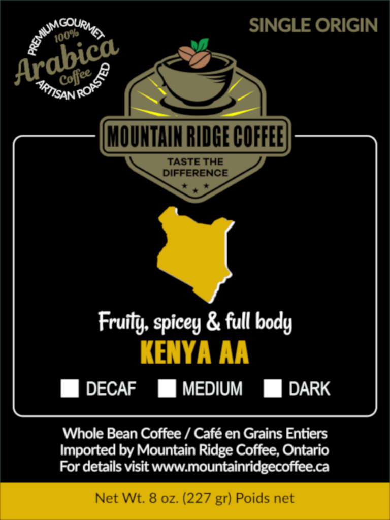
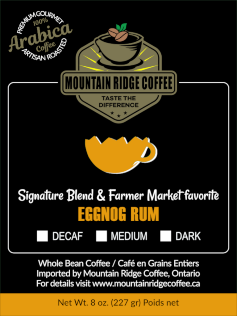
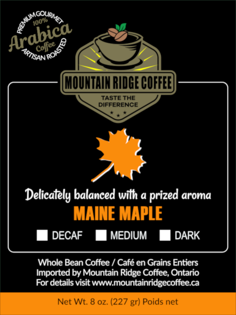
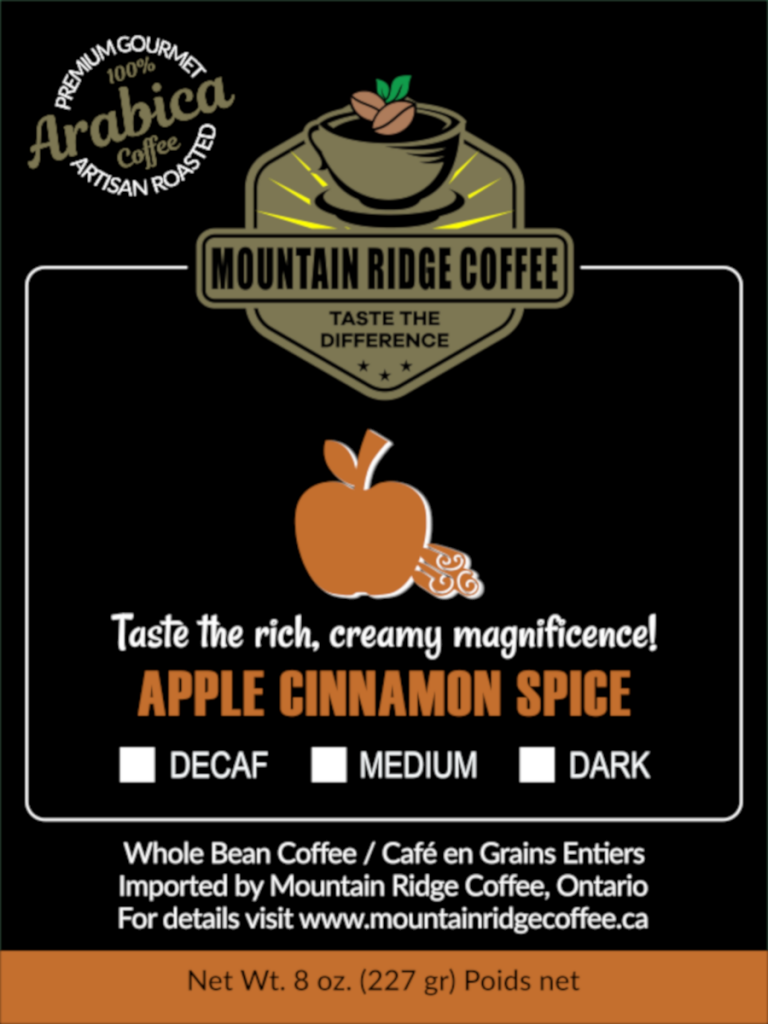
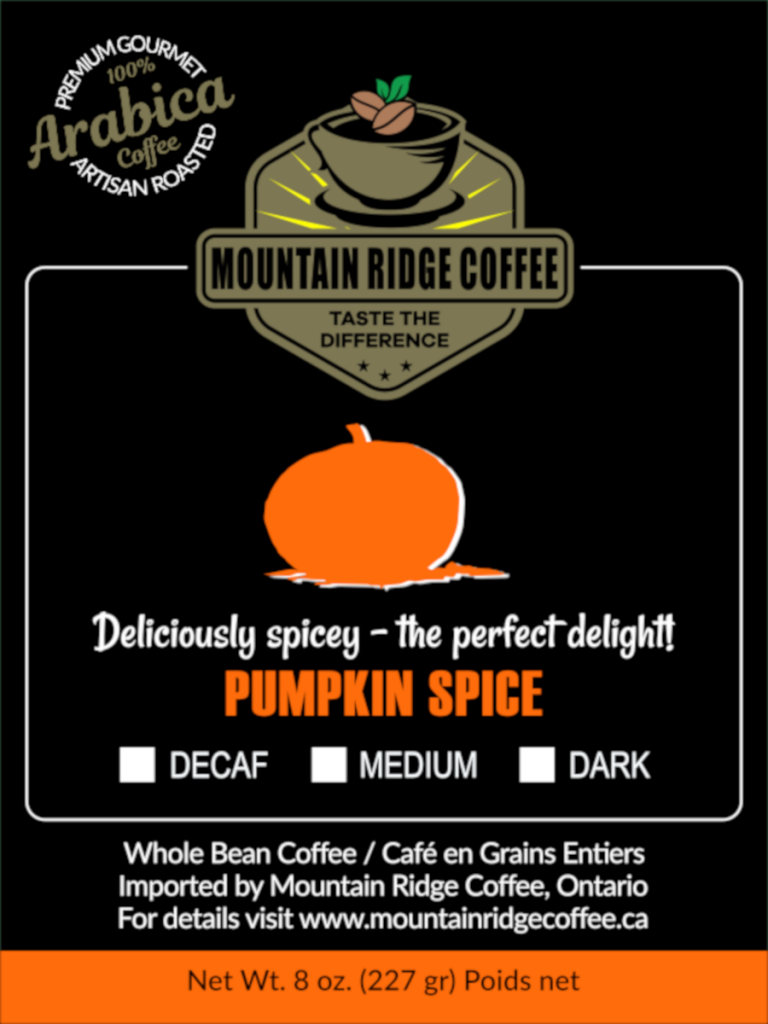
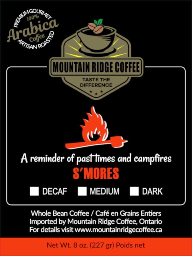
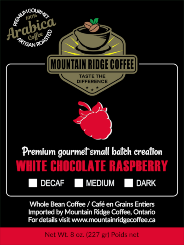
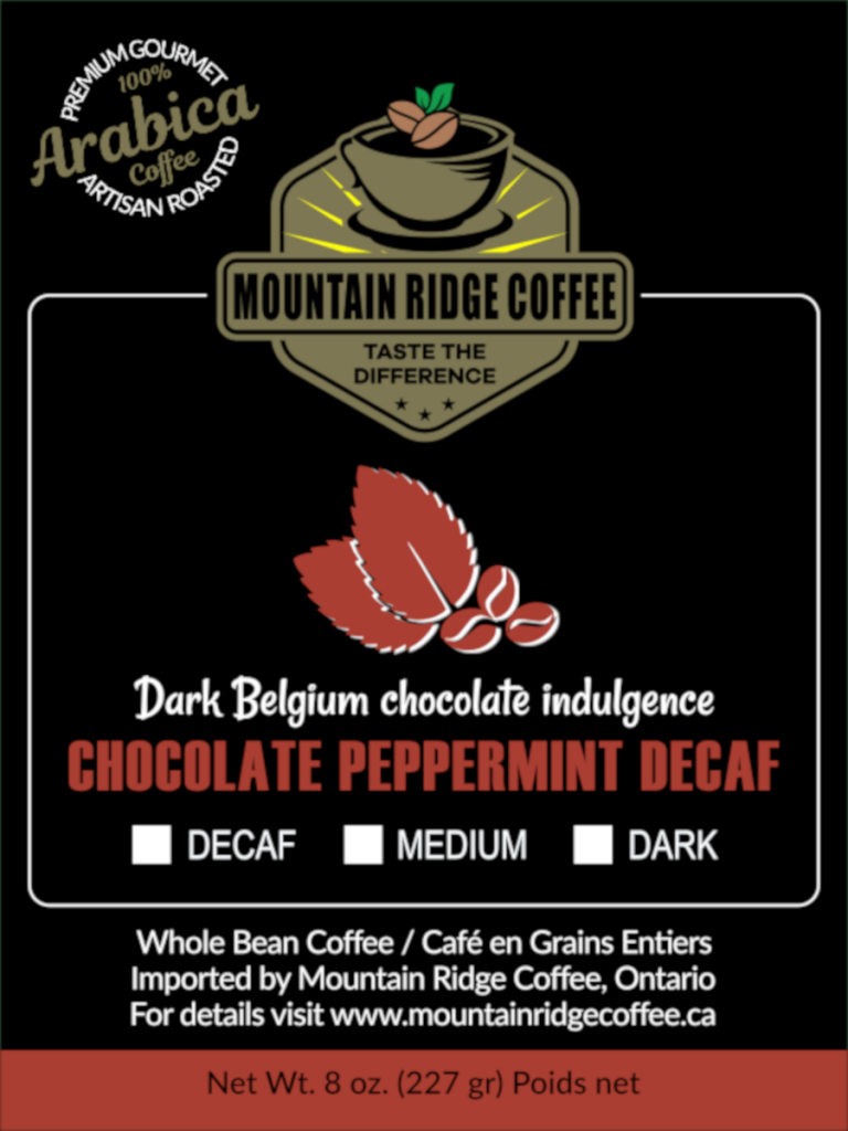
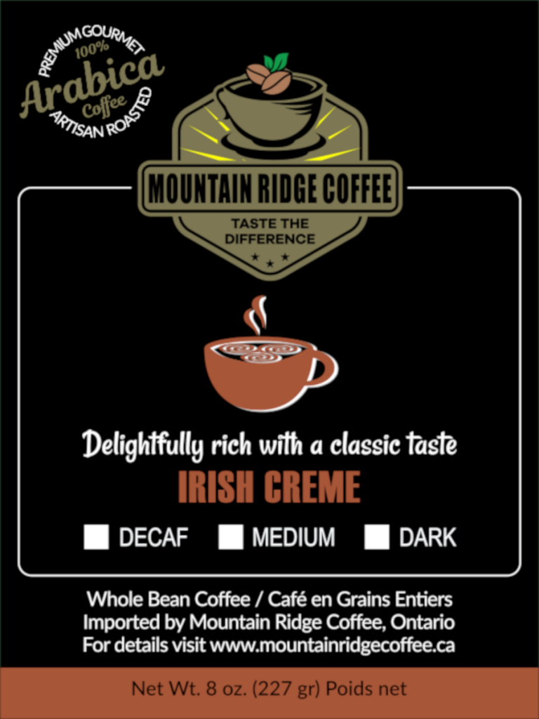
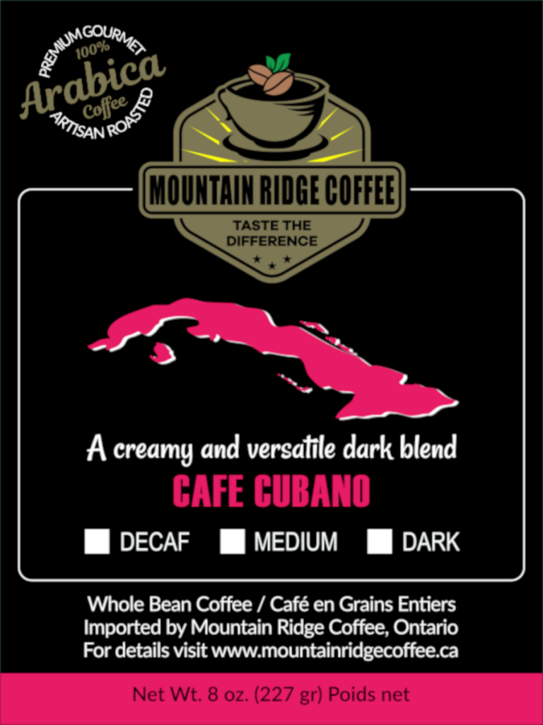
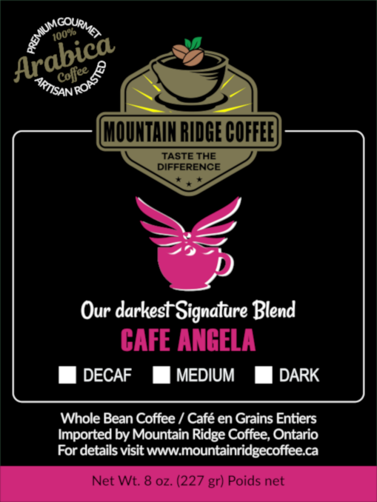
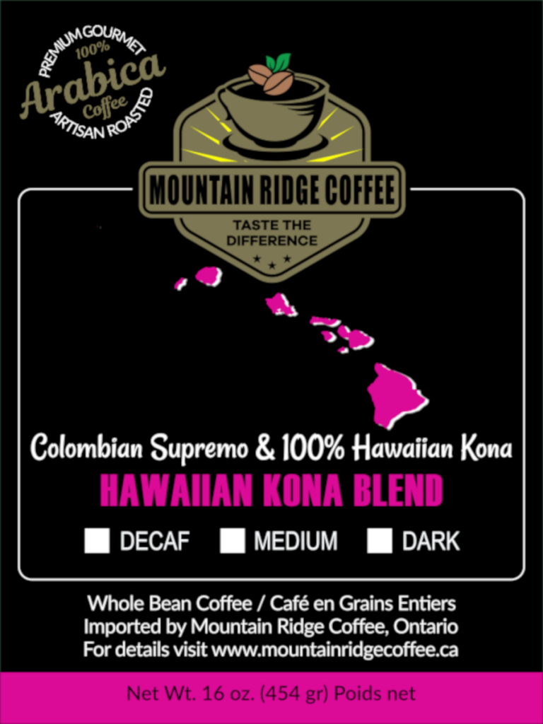
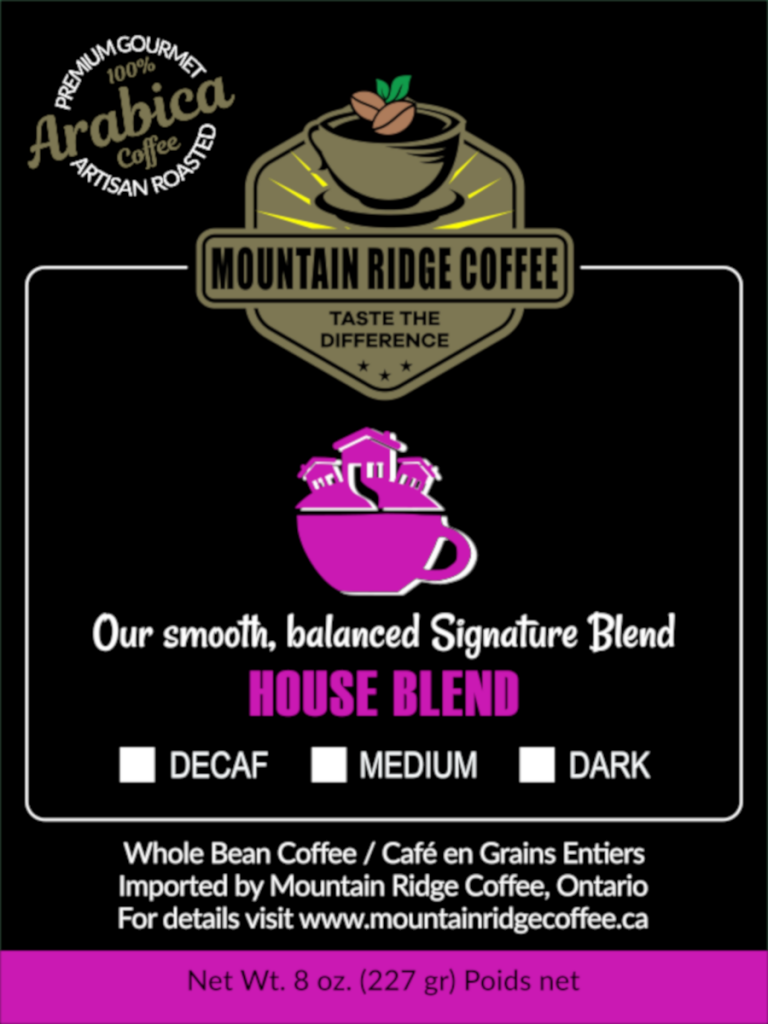
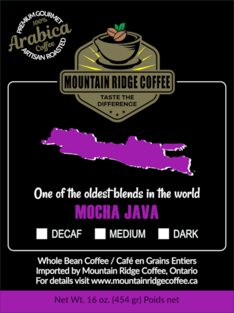
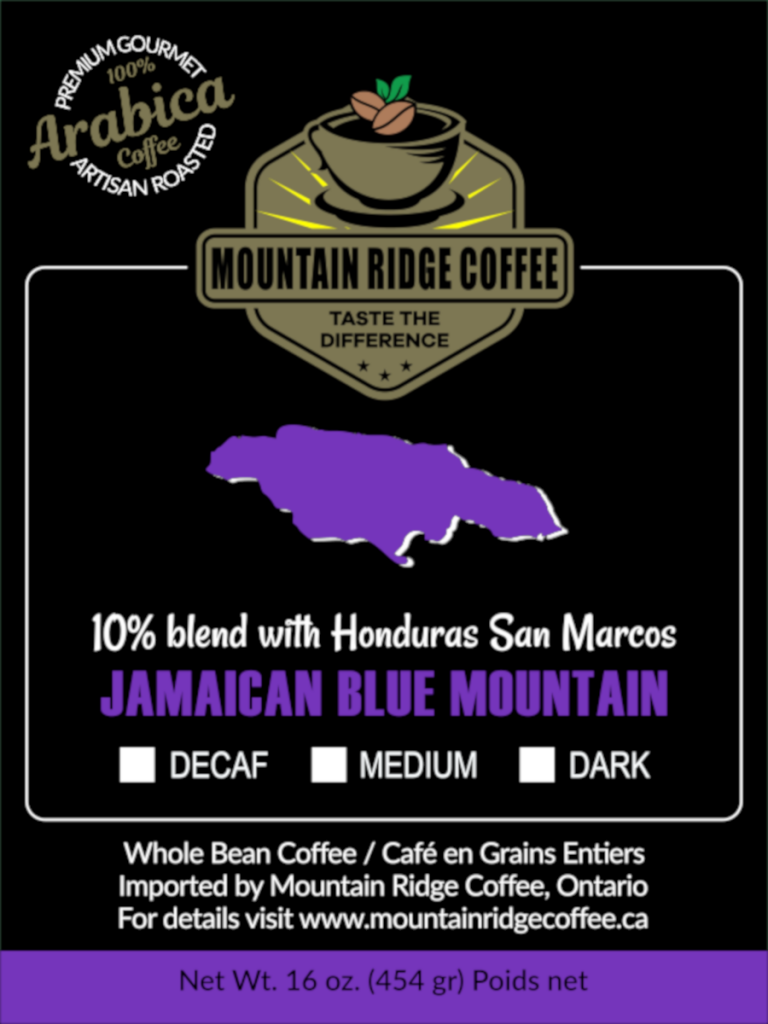
‘Black Opium Coffee’ needed some packaging labels for their new range of coffee beans. They were looking for a consistent design style across nine labels but something unique and beautiful about each individual type of coffee.

OUTCOME:
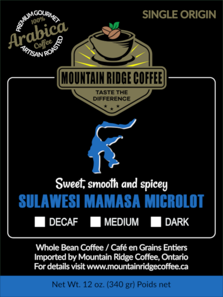
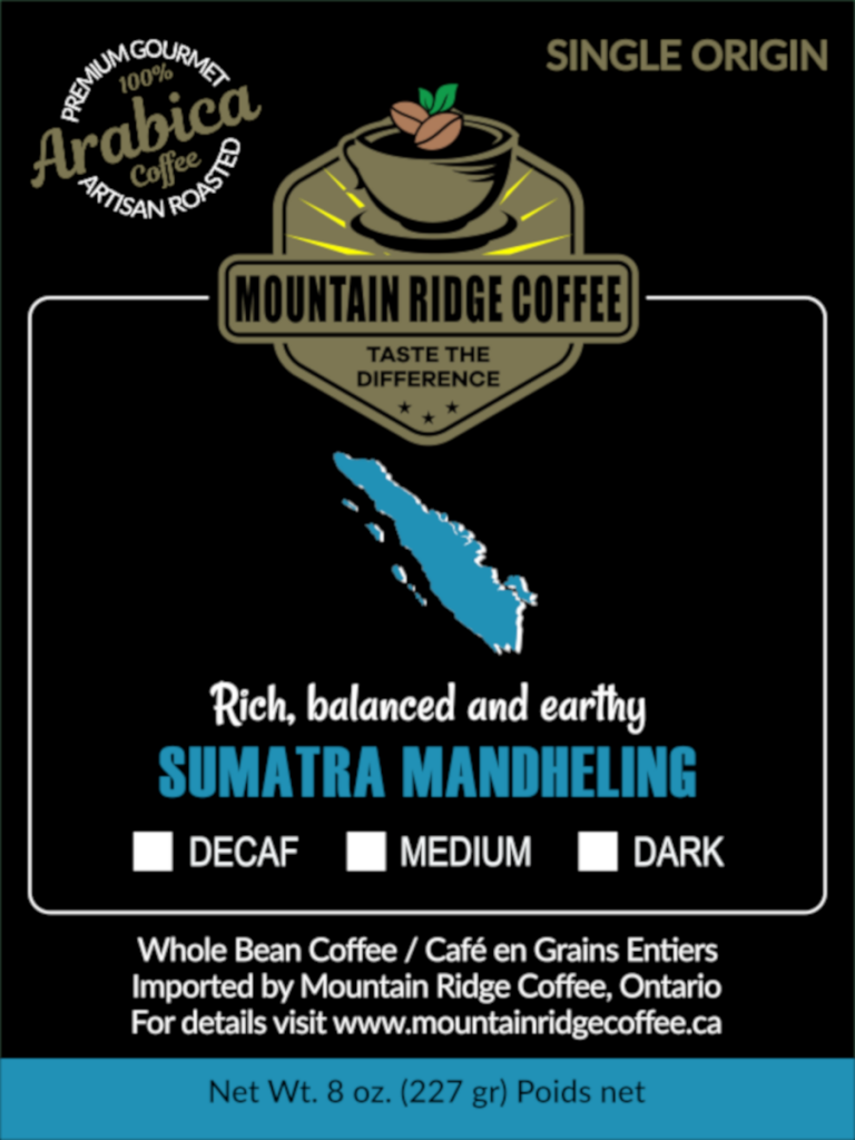
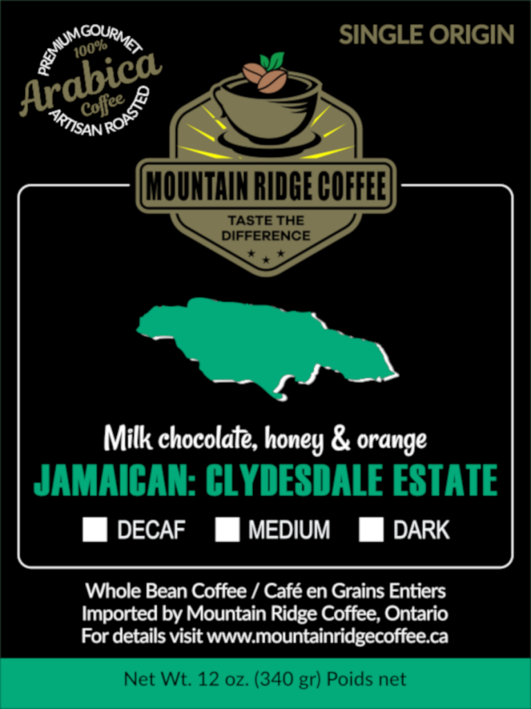
These original concepts were created for ‘Black Opium Coffee’ using a range of different colours and imagery to distinguish between the different coffee selections available. These designs resulted in ‘Mountain Ridge Coffee’ hiring me to create similar labels for their new business as well.

BRANDING
GRAPHIC DESIGN
PACKAGING

PACKAGING – Mountain Ridge Coffee

The Pinnacle Of Artisan Coffee

DESIGN BRIEF:
Your labels for ‘Black Opium Coffee’ were amazing and I was looking for something similar for my coffee line of products at ‘Mountain Ridge Coffee’. I have 24 different coffees – 10 single origin 6 blends and 8 flavours. All of which can be created using 5 different colours (3 for my Single Origins, 1 for Blends and 1 for flavours).

PRODUCT PACKAGING
GRAPHIC DESIGN
ICONS & INFOGRAPHICS

OUTCOME:
These labels may have been inspired by my previous ‘Black Opium Coffee’ concepts, however, the final designs are a more distinctive reflection of the vibrant, earthy, artisan and premium quality that is unique to the ‘Mountain Ridge Coffee’ brand. Each label was created with its own colour, description and graphics to distinguish between each of the individual coffee products, using 5 different colour palettes to unify the flavours (oranges, browns and reds), blends (pinks and purples) and single origin collections (Asia/blues, Africa/Yellows, and America/Greens).