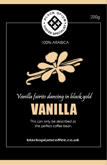
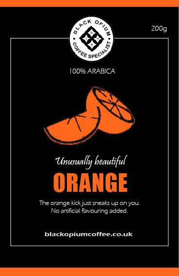
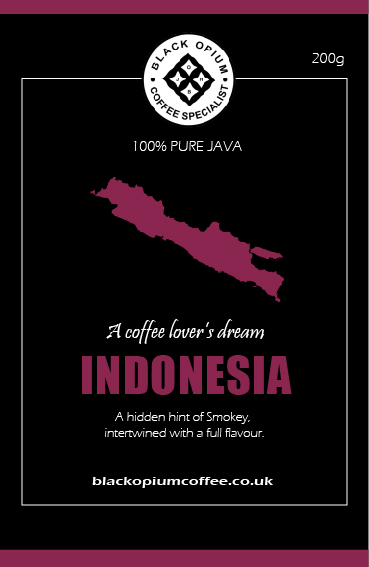
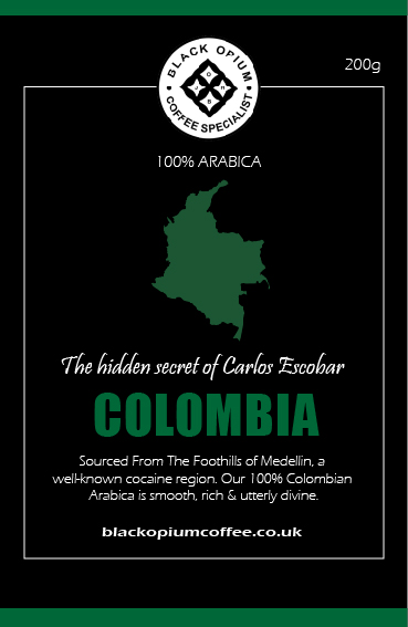
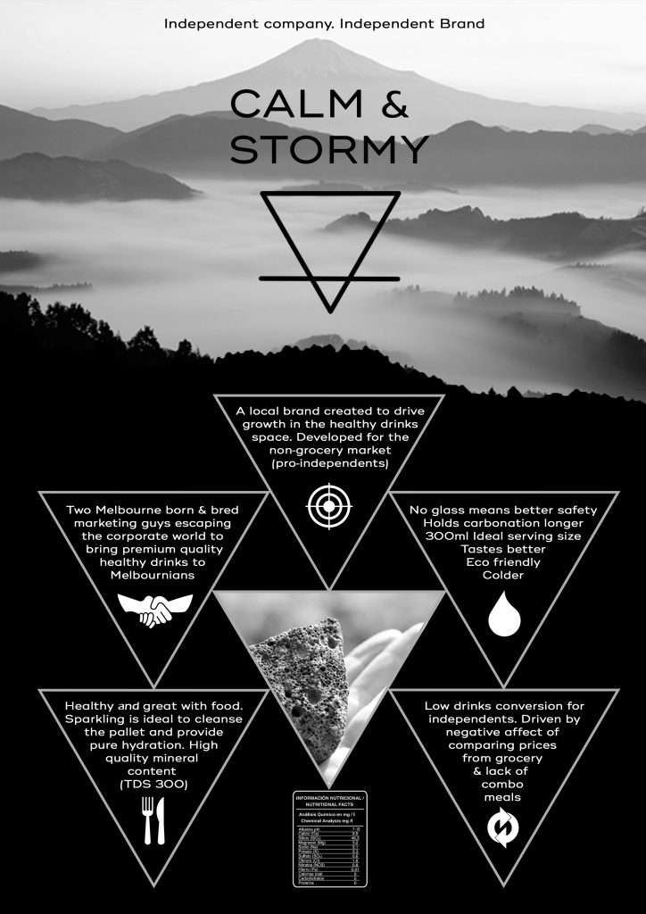
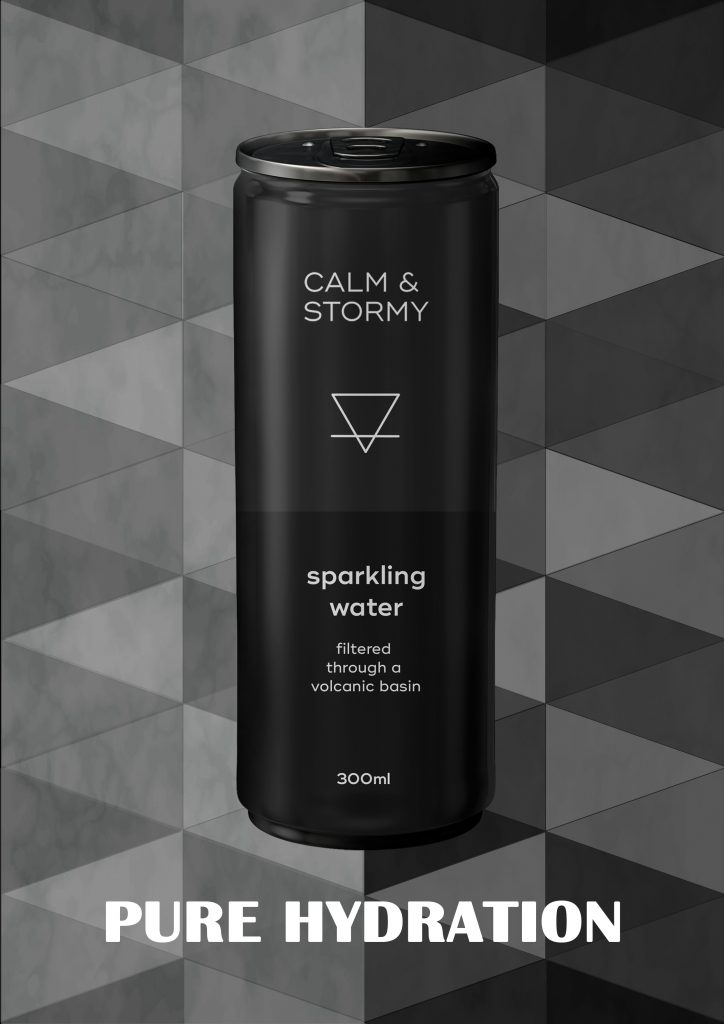
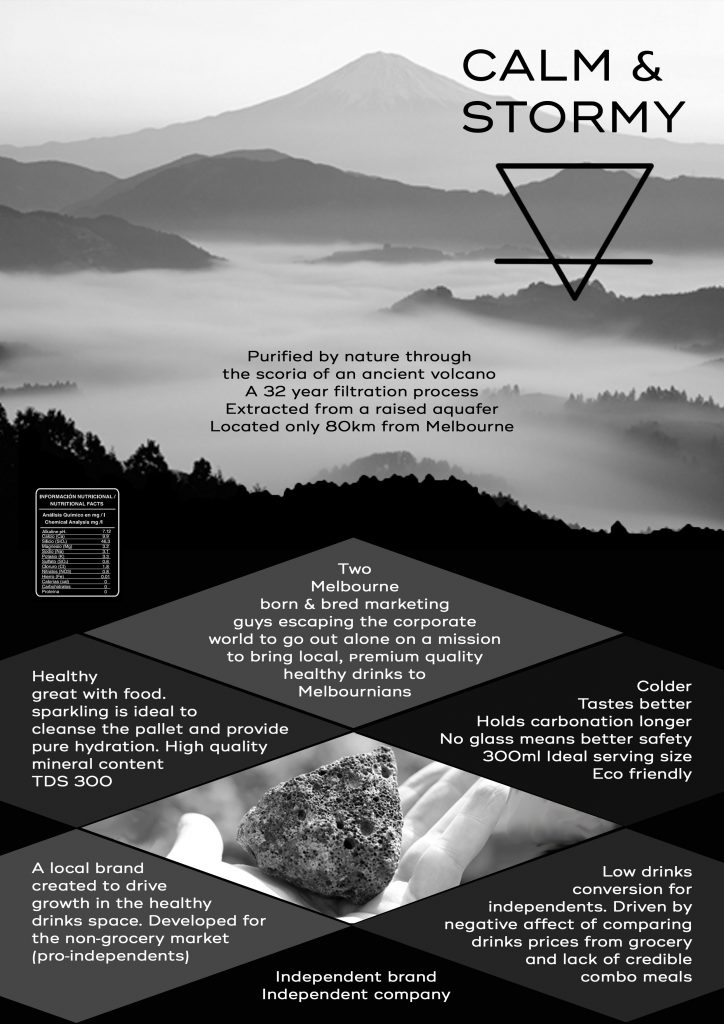
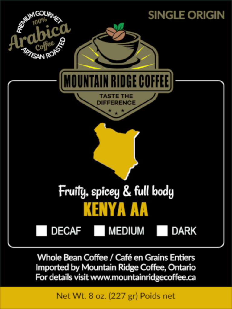
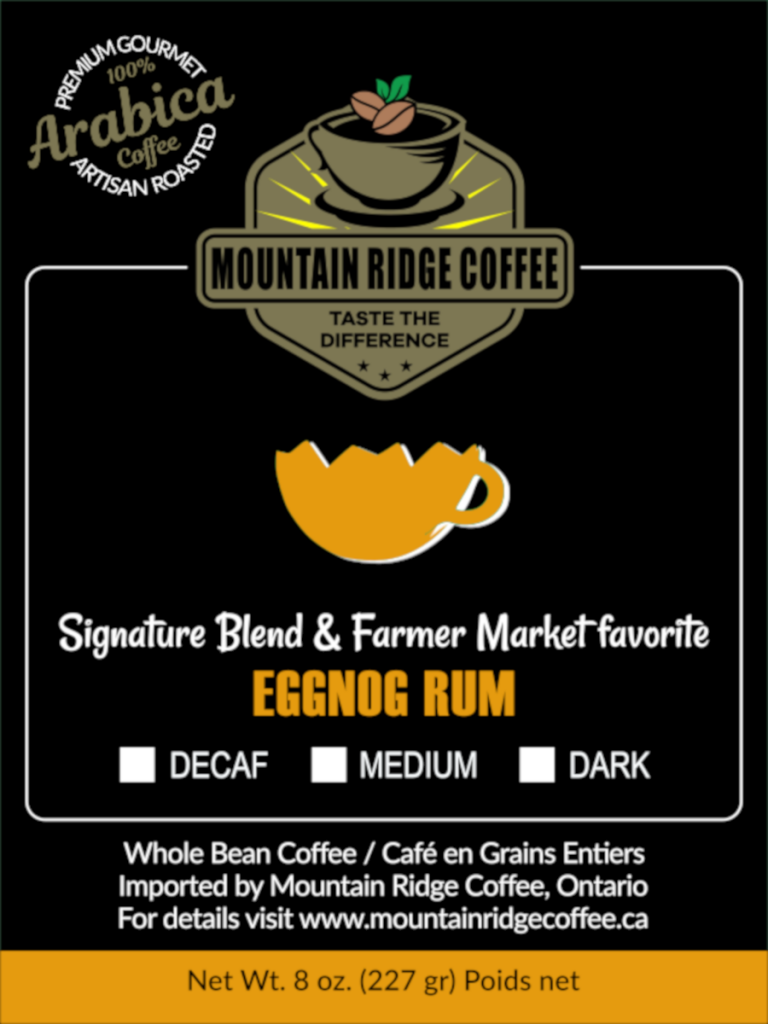
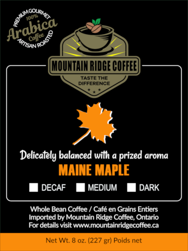
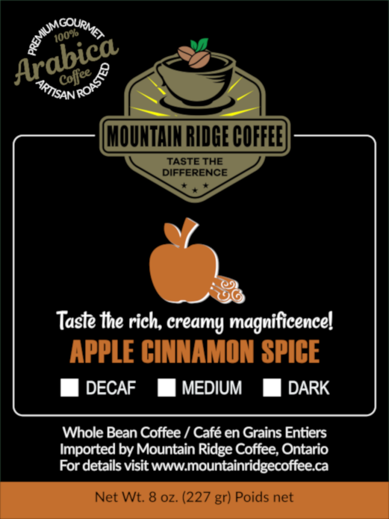
GRAPHIC DESIGN

GRAPHIC DESIGN

Graphic design is the best way to visually communicate your brand’s message.

Great graphic design uses a range of consistent branding style elements to reflect the words expressed in your marketing collateral and to clearly define a variety of different content in a simple way that is easily understood by your target audience. Graphic design will create a polished and professional presentation of your business that will stimulate more profitable outcomes for your marketing efforts.

“Graphic design is really about creating more clarity – and less clutter.”

KELLY FERRIS

POSTER – Bowraville Memorial Cup

All-In-One Loving Memory

DESIGN BRIEF:
A sample poster design was requested by the team at ‘Ready Mob’ to present at an interview for a Website Designer position that could be used to promote the upcoming ‘Bowraville Memorial Cup’ event.

OUTCOME:
An All-In-One Poster design was created to advertise the ‘Bowraville Memorial Cup’ event that could be printed as A4 and A3 posters, A4 and A5 flyers and incorporates a variety of images in different shapes and sizes that could be easily posted in social media feeds – all from one single design. The team from ‘Ready Mob’ were very impressed with the initial concept for this poster design and hired me as their new Website Designer as a result.

BRANDING
GRAPHIC DESIGN
POSTERS & FLYERS
PHOTO EDITING

POSTERS – SIES Fund

Saving Endangered Wildlife

DESIGN BRIEF:
A group of 20 students from ‘Southern Cross University’ (including myself) were granted a New Colombo Plan scholarship to support wildlife conservation projects in Sumatra, Indonesia. Many of the students requested some posters to display at their fundraising events for ‘Save Indonesian Endangered Species Fund’ and to post online in their social media feeds.

OUTCOME:
A series of posters were created using images supplied by ‘Save Indonesian Endangered Species Fund’ for future exhibitions and events, including fundraising activities organised by ‘Southern Cross University’ student scholarship recipients. While these designs received great feedback from all of the students and staff involved, they also gained a lot of attention from the wider public which lead to a significant increase in donations and support.

POSTER – Kempsey Healing Together

All-In-One Healing Together

DESIGN BRIEF:
To create a poster to promote a New Year’s Pool Party school holiday event for ‘Kempsey Healing Together’ and other associated organisations, including ‘Ready Mob’. The design was aimed at the youth and families in the Kempsey region.

OUTCOME:
An All-In-One Poster was created from this single design to allow for single-side printing in A4 and A3 sizes, as well as double-sided printing for A4 and A5 flyers. The final design can also be cropped in a variety of different shapes and sizes for publishing on all popular social media platforms. This design received amazing feedback from the whole team at ‘Kempsey Healing Together’, ‘Ready Mob’, staff from the organisations involved and many residents in the local community.

PHOTO EDITING
GRAPHIC DESIGN
POSTERS & FLYERS
SOCIAL MEDIA

INSTAGRAM POST
INSTAGRAM POST
FACEBOOK HEADER
FACEBOOK HEADER
SOCIAL MEDIA POST
SOCIAL MEDIA POST
FLYER – FRONT
FLYER – BACK

POSTER – Youth Connections

Getting Youth Connected

DESIGN BRIEF:
An assessment task was given to ‘Southern Cross University’ Media Students to create a poster for ‘Youth Connections North Coast’ to promote their extensive services to the Northern Rivers community. The design needed to reflect the values of organisation and be appropriate for their target market. This task was also held as a Design Competition, with over 60 posters entered and judged by Youth Connections Staff.

OUTCOME:
This final design was awarded as First Place Winner in the ‘Southern Cross University’ Design Competition and was selected for promoting the ‘Youth Connections North Coast’ services all over the Northern Rivers region. This assignment was worth 35% of the final course grade and this design achieved a Distinction.

BRANDING
PHOTOGRAPHY
GRAPHIC DESIGN

WEB DESIGN – Cream Collection

Cream Collection Online

DESIGN BRIEF:
The team from ‘Cream Collection’ wanted to update the colours and styling of their existing website to create a more cohesive look across all of the pages.

BRANDING
GRAPHIC DESIGN
WEB DESIGN
SOCIAL MEDIA

OUTCOME:
These concepts were designed for ‘Cream Collection’ using a new balance of their existing branding style elements, with less green and more cream so that their dark grey logo and product images are the most dominant features of their site. New square images were created for the Blog and How-To pages that could easily be shared on Instagram and social media platforms with links back to the website as well.

LANDING PAGE
HOW-TO PAGE
BLOG PAGE
INSTAGRAM FEED

BILLBOARDS – Butt Out Kids About!

Out And About Our Towns

DESIGN BRIEF:
To create a series of 4 billboards to promote the ‘Butt Out Kids About!’ Who Are You Sharing Your Smoke With? campaign for ‘Ready Mob’. These billboards needed to feature Indigenous children from each of the four towns on the Mid North Coast of Australia where each of these would be displayed, including Port Macquarie, Macksville, Coffs Harbour and Kempsey.

GRAPHIC DESIGN
PHOTO EDITING
BILLBOARDS
SIGNAGE
CAMPAIGNS

OUTCOME:
These billboards were created in collaboration with designers from ‘Ooh Media!’ and the team at ‘Ready Mob’ with a great response from each of the local communities. The designs included a competition to win NRL (National Rugby League) Grand Final tickets, accommodation and other prizes via an entry form on their website. These billboards were part of the ‘Butt Out Kids About!’ Who Are You Sharing Your Smoke With? campaign which also included TV commercials.

MACKSVILLE
KEMPSEY
COFFS HARBOUR
PORT MACQUARIE

LOGO – Baklover Kitchen

A Logo For Baklava Lovers

DESIGN BRIEF:
After registering her business name, ‘The Baklover Kitchen’ and choosing a style direction from a selection of mood boards, Amy needed a logo. She wanted a design that looked professional and pretty to use on social media, business cards and packaging that would be displayed in cafes, restaurants, other food retailers and her market stalls.

OUTCOME:
A few different concepts were created for ‘The Baklover Kitchen’ and this concept was chosen for the final design. A range of different variations, colours and sizes were provided to suit any application, with raised gold foil layers to make the logo design look even prettier when printed.

BRANDING
LOGO DESIGN
GRAPHIC DESIGN

POSTERS – Find Tom’s Cello

Making Music With Marketing

DESIGN BRIEF:
Tom had left his cello on the side of the road after busking in Brisbane, Australia and had been trying hard to find it for over six weeks. ‘Tom and Charlie’ decided to hire me to help with their marketing efforts to ‘Find Tom’s Cello’ and increase the chances of his much loved instrument returning to him.

OUTCOME:
A new poster design was created in various sizes for promoting around Brisbane and the Northern Rivers region, on social media platforms, as well as distributing through the crowd and displaying on stage while ‘Tom and Charlie’ performed at the ‘Splendour in the Grass’ Festival in Byron Bay. Our ‘Find Tom’s Cello’ campaign lead to interviews with ABC Radio and other local media outlets, with the cello found and returned to its very grateful owner in less than six days!

GRAPHIC DESIGN
PHOTO EDITING
POSTERS & FLYERS
CAMPAIGNS

LOGOS – Galambila AMS

An Artistic Logo Remedy

DESIGN BRIEF:
‘Galambila Aboriginal Medical Service’ in Coffs Harbour, Australia had an existing logo that was beautifully designed by a local Indigenous artist. However, the white background limited use in other design applications and the small size they had was unsuitable for large-scale projects, including the billboards and TV commercials being created for ‘Ready Mob’ as part of their ‘Butt Out Kids About!’ campaign.

OUTCOME:
The existing logo design for ‘Galambila Aboriginal Medical Service’ was digitally redrawn in high-resolution using scalable vectors to prevent the small original logo from looking pixelated or blurry in large applications. The white background was also removed so we could overlay the logo on photographs and coloured backgrounds in future design projects, including the ‘Butt Out Kids About!’ campaign for ‘Ready Mob’.

LOGO DESIGN
GRAPHIC DESIGN

ORIGINAL LOGO
REWORKED LOGO

POSTERS – Tom & Charlie

Promoter of Performers

DESIGN BRIEF:
‘Tom and Charlie’ were booked for a last minute gig in Byron Bay following their performance at the ‘Splendour in the Grass’ festival. They asked me to create a poster using supplied images for promoting the event in a similar style to the ‘Find Tom’s Cello’ posters that were displayed all over the Northern Rivers region a few weeks earlier.

BRANDING
GRAPHIC DESIGN
POSTERS & FLYERS

OUTCOME:
Two designs were created for ‘Tom and Charlie’ to use for promoting their upcoming event and included blank templates they could edit for other future gigs also. These posters were recognisable by many locals who had seen and supported the ‘Find Tom’s Cello’ campaign and gained attention from new audiences as well. These posters attracted a large crowd to their gig despite having only three days to promote the event.

PITCH DECK – Arnott Capital

Pitch Perfect Presentations

DESIGN BRIEF:
An international design competition was held to create a pitch deck in Powerpoint for ‘Arnott Capital’ to use when promoting their wholesale investment services to potential clients. The design needed a strong corporate look using existing branding style elements to appeal to their professional target market.

OUTCOME:
This pitch deck design was awarded First Place in the competition and received amazing feedback from ‘Arnott Capital’. There were over 20 pages in the final pitch deck with a small sample of selected pages shown below.

GRAPHIC DESIGN
ICONS & INFOGRAPHICS
PITCH DECKS
CAMPAIGNS

POSTERS – Drumadics Band

Drumadic First Encounters

DESIGN BRIEF:
An international design competition was held for ‘Drumadics Beats-N-Brass Band’ in New York, USA to create some posters to print and to promote their upcoming tour on social media. These posters needed to have an outer space feel, almost like aliens first encounter with mankind or an initial descend onto Earth and they wanted it to be colourful, creative, fun, eye-catching and to represent the unique and high energy sound of their music.

OUTCOME:
The concepts created for ‘Drumadics Beats-N-Brass Band’ were awarded First Prize in the design competition and the final designs were used to promote their tour across the East Coast of the USA and their social media platforms.

GRAPHIC DESIGN
POSTERS & FLYERS
PHOTO EDITING

POSTERS – Southern Cross University

Rumble For The Jungle

DESIGN BRIEF:
A group of students from ‘Southern Cross University’ needed a poster to promote their fundraising event to support wildlife conservation projects with ‘Save Indonesian Endangered Species Fund’ in Sumatra, Indonesia. The students chose a pirate theme for the event and wanted a posted that reflected this theme.

ILLUSTRATION
GRAPHIC DESIGN
POSTERS & FLYERS
CAMPAIGNS

OUTCOME:
A few illustrations of different concepts were presented to the students to vote on the final concept that would be digitally created for their promotional activities on social media and displaying around ‘Southern Cross University’ in Lismore, Australia, as well as surrounding suburbs for advertising to the general public. The feedback from the students, staff and supporting businesses was extremely positive and the event attracted a large crowd which helped the students exceed their fundraising targets for the ‘Save Indonesian Endangered Species Fund’ conservation projects.

PACKAGING – Black Opium Coffee

Created for Coffee Addicts

DESIGN BRIEF:
‘Black Opium Coffee’ needed some packaging labels for their new range of coffee beans. They were looking for a consistent design style across nine labels but something unique and beautiful about each individual type of coffee.

OUTCOME:
These original concepts were created for ‘Black Opium Coffee’ using a range of different colours and imagery to distinguish between the different coffee selections available. These designs resulted in ‘Mountain Ridge Coffee’ hiring me to create similar labels for their new business as well.

BRANDING
GRAPHIC DESIGN
PACKAGING

PITCH DECK – Green Farm

For Investing In Green Farming

DESIGN BRIEF:
A pitch deck was needed for ‘Green Farm Laboratory’ to use in marketing their new greenhouse design to potential investors and clients. Their existing pitch deck was black and white text with a few cartoon images and did not have the professional look that they wanted to successfully appeal to financial investors.

BRANDING
GRAPHIC DESIGN
ICONS & INFOGRAPHICS
PITCH DECKS
CAMPAIGNS

OUTCOME:
The new pitch deck design was totally revamped with a new branding style, layout and content to give ‘Green Farm Laboratory’ a more professional image and to clearly summarise the business proposal to potential investors. Key information was taken from their existing pitch deck and business plan with a stronger focus on financial forecasts and the benefits to all stakeholders. The final design exceeded the expectations of ‘Green Farm Laboratory’ and generated a significant increase in meetings with interested investors. The pitch deck had 22 pages with samples (excluding financial tables and top secret information) below:

PRINT – Yiriman Women

Bush Knowledge Enterprises

DESIGN BRIEF:
To produce a set of front and rear cover designs for three reports which need a consistent look and feel to make them a ‘set’. The ‘Yiriman Women’ are an Indigenous group and the design needed to convey a sense of earthy integrity with a friendly and authoritative look, but not too corporate.

OUTCOME:
The concepts that were created for the three document covers using images supplied by ‘Yiriman Women’.

BRANDING
GRAPHIC DESIGN
PHOTO EDITING
DOCUMENTS

SIGNAGE – Ready Mob

A Frame For Events

DESIGN BRIEF:
To create a series of designs for ‘Ready Mob’ to be printed on double-sided corflute A-Frame signs to display around their stalls at community events that represent all of their brands, such as ‘Butt Out Kids About!’ and ‘Deadly-N-Ready’.

BRANDING
GRAPHIC DESIGN
SIGNAGE

OUTCOME:
A selection of A-Frame designs were created for ‘Ready Mob’ to choose from that they could display at various community events. These designs promote each of their brands, including ‘Butt Out Kids About!’ and ‘Deadly-N-Ready’, allowing the team the option to select which ones are most relevant to their promotional activities and best suited to the age groups in attendance at any event.

READY MOB #1
READY MOB #2
READY MOB #3
READY MOB #4
BUTT OUT KIDS ABOUT! #1
BUTT OUT KIDS ABOUT! #3
BUTT OUT KIDS ABOUT! #4
DEADLY-N-READY #1
DEADLY-N-READY #2
DEADLY-N-READY #3
DEADLY-N-READY #4

POSTER – Calm & Stormy

Promoting Pure Hydration

DESIGN BRIEF:
To create a double-sided poster for ‘Calm & Stormy’ to distribute to promote their new sparkling mineral water in cool cafes and bars around Melbourne, Australia. The design needed to be monochrome, minimalistic, a bit abstract, combining shapes, icons, typography and two supplied images in an unconventional layout.

OUTCOME:
A few different concepts were created for the poster design for ‘Calm & Stormy’ to choose from with positive feedback received.

BRANDING
GRAPHIC DESIGN
POSTERS & FLYERS

FRONT #1
BACK #1
FRONT #2
BACK #2

SIGNAGE – Deadly-N-Ready

Deadly-N-Ready On The Field

DESIGN BRIEF:
Create two large signs to promote the ‘Deadly-N-Ready’ campaign for ‘Ready Mob’ at the Sawtell Football Fields on the Mid North Coast of NSW, Australia.

OUTCOME:
These designs were created in a similar style to existing signs in other venues, specifically aimed at targeting the youth audience for ‘Ready Mob’, while strengthening the ‘Deadly-N-Ready’ branding style even further.

BRANDING
GRAPHIC DESIGN
BILLBOARDS
SIGNAGE

PACKAGING – Mountain Ridge Coffee

The Pinnacle Of Artisan Coffee

DESIGN BRIEF:
Your labels for ‘Black Opium Coffee’ were amazing and I was looking for something similar for my coffee line of products at ‘Mountain Ridge Coffee’. I have 24 different coffees – 10 single origin 6 blends and 8 flavours. All of which can be created using 5 different colours (3 for my Single Origins, 1 for Blends and 1 for flavours).

PRODUCT PACKAGING
GRAPHIC DESIGN
ICONS & INFOGRAPHICS

OUTCOME:
These labels may have been inspired by my previous ‘Black Opium Coffee’ concepts, however, the final designs are a more distinctive reflection of the vibrant, earthy, artisan and premium quality that is unique to the ‘Mountain Ridge Coffee’ brand. Each label was created with its own colour, description and graphics to distinguish between each of the individual coffee products, using 5 different colour palettes to unify the flavours (oranges, browns and reds), blends (pinks and purples) and single origin collections (Asia/blues, Africa/Yellows, and America/Greens).