PITCH DECK – Arnott Capital

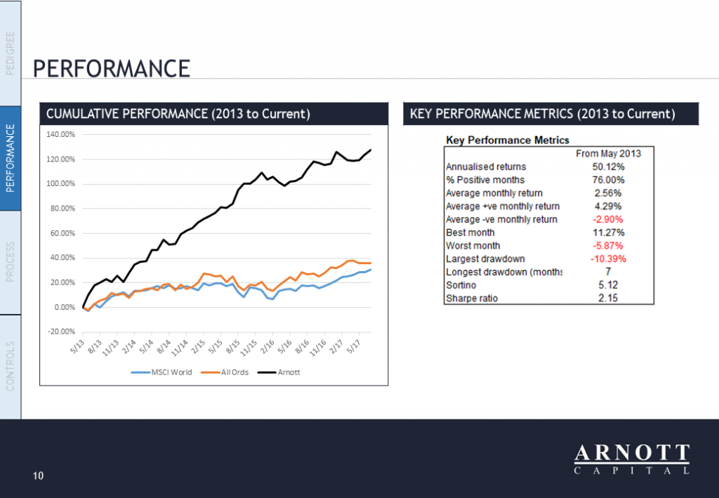
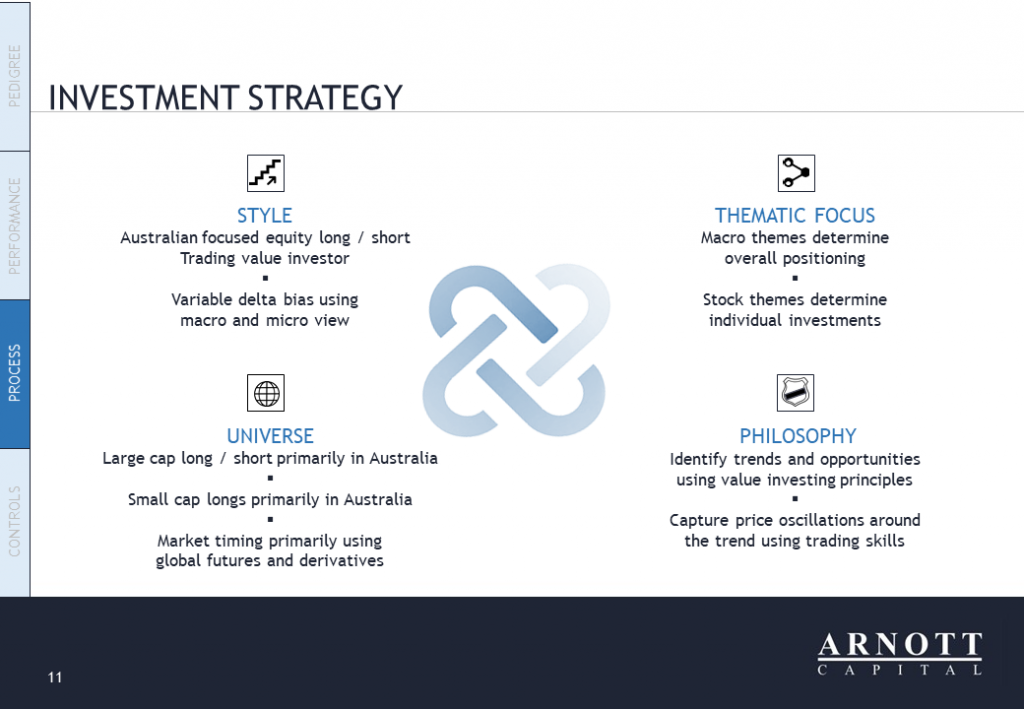
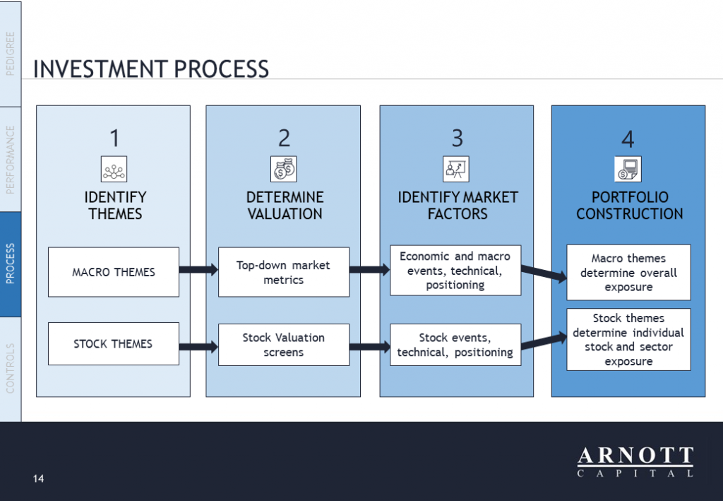
Pitch Perfect Presentations

DESIGN BRIEF:
An international design competition was held to create a pitch deck in Powerpoint for ‘Arnott Capital’ to use when promoting their wholesale investment services to potential clients. The design needed a strong corporate look using existing branding style elements to appeal to their professional target market.

OUTCOME:
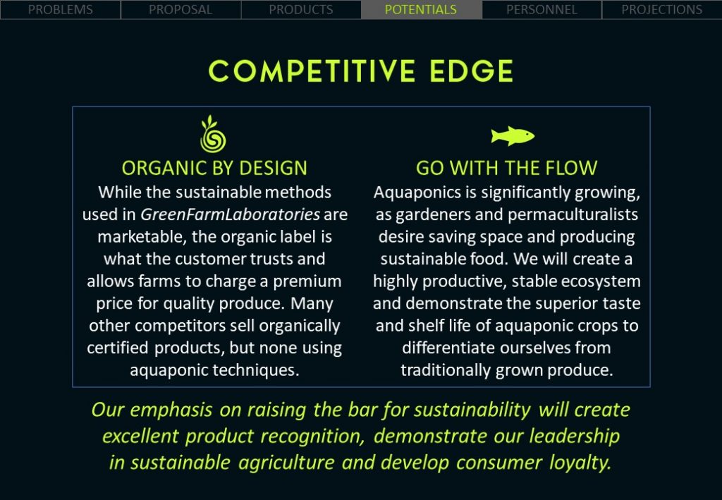
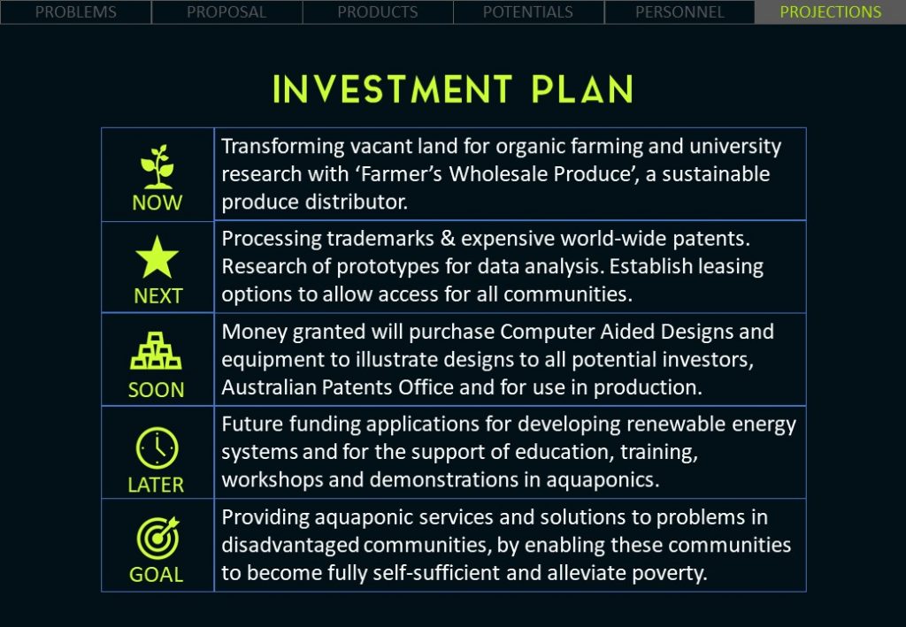
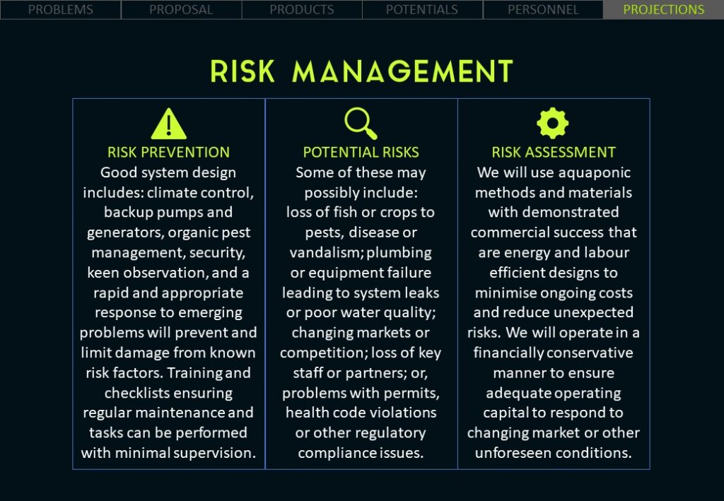
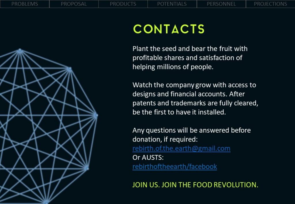
This pitch deck design was awarded First Place in the competition and received amazing feedback from ‘Arnott Capital’. There were over 20 pages in the final pitch deck with a small sample of selected pages shown below.

GRAPHIC DESIGN
ICONS & INFOGRAPHICS
PITCH DECKS
CAMPAIGNS

POSTERS – Southern Cross University

Rumble For The Jungle

DESIGN BRIEF:
A group of students from ‘Southern Cross University’ needed a poster to promote their fundraising event to support wildlife conservation projects with ‘Save Indonesian Endangered Species Fund’ in Sumatra, Indonesia. The students chose a pirate theme for the event and wanted a posted that reflected this theme.

ILLUSTRATION
GRAPHIC DESIGN
POSTERS & FLYERS
CAMPAIGNS

OUTCOME:
A few illustrations of different concepts were presented to the students to vote on the final concept that would be digitally created for their promotional activities on social media and displaying around ‘Southern Cross University’ in Lismore, Australia, as well as surrounding suburbs for advertising to the general public. The feedback from the students, staff and supporting businesses was extremely positive and the event attracted a large crowd which helped the students exceed their fundraising targets for the ‘Save Indonesian Endangered Species Fund’ conservation projects.

PACKAGING – Black Opium Coffee

Created for Coffee Addicts

DESIGN BRIEF:
‘Black Opium Coffee’ needed some packaging labels for their new range of coffee beans. They were looking for a consistent design style across nine labels but something unique and beautiful about each individual type of coffee.

OUTCOME:
These original concepts were created for ‘Black Opium Coffee’ using a range of different colours and imagery to distinguish between the different coffee selections available. These designs resulted in ‘Mountain Ridge Coffee’ hiring me to create similar labels for their new business as well.

BRANDING
GRAPHIC DESIGN
PACKAGING

PITCH DECK – Green Farm

For Investing In Green Farming

DESIGN BRIEF:
A pitch deck was needed for ‘Green Farm Laboratory’ to use in marketing their new greenhouse design to potential investors and clients. Their existing pitch deck was black and white text with a few cartoon images and did not have the professional look that they wanted to successfully appeal to financial investors.

BRANDING
GRAPHIC DESIGN
ICONS & INFOGRAPHICS
PITCH DECKS
CAMPAIGNS

OUTCOME:
The new pitch deck design was totally revamped with a new branding style, layout and content to give ‘Green Farm Laboratory’ a more professional image and to clearly summarise the business proposal to potential investors. Key information was taken from their existing pitch deck and business plan with a stronger focus on financial forecasts and the benefits to all stakeholders. The final design exceeded the expectations of ‘Green Farm Laboratory’ and generated a significant increase in meetings with interested investors. The pitch deck had 22 pages with samples (excluding financial tables and top secret information) below:

POSTER – Calm & Stormy

Promoting Pure Hydration

DESIGN BRIEF:
To create a double-sided poster for ‘Calm & Stormy’ to distribute to promote their new sparkling mineral water in cool cafes and bars around Melbourne, Australia. The design needed to be monochrome, minimalistic, a bit abstract, combining shapes, icons, typography and two supplied images in an unconventional layout.

OUTCOME:
A few different concepts were created for the poster design for ‘Calm & Stormy’ to choose from with positive feedback received.

BRANDING
GRAPHIC DESIGN
POSTERS & FLYERS

FRONT #1
BACK #1
FRONT #2
BACK #2

PACKAGING – Mountain Ridge Coffee

The Pinnacle Of Artisan Coffee

DESIGN BRIEF:
Your labels for ‘Black Opium Coffee’ were amazing and I was looking for something similar for my coffee line of products at ‘Mountain Ridge Coffee’. I have 24 different coffees – 10 single origin 6 blends and 8 flavours. All of which can be created using 5 different colours (3 for my Single Origins, 1 for Blends and 1 for flavours).

PRODUCT PACKAGING
GRAPHIC DESIGN
ICONS & INFOGRAPHICS

OUTCOME:
These labels may have been inspired by my previous ‘Black Opium Coffee’ concepts, however, the final designs are a more distinctive reflection of the vibrant, earthy, artisan and premium quality that is unique to the ‘Mountain Ridge Coffee’ brand. Each label was created with its own colour, description and graphics to distinguish between each of the individual coffee products, using 5 different colour palettes to unify the flavours (oranges, browns and reds), blends (pinks and purples) and single origin collections (Asia/blues, Africa/Yellows, and America/Greens).