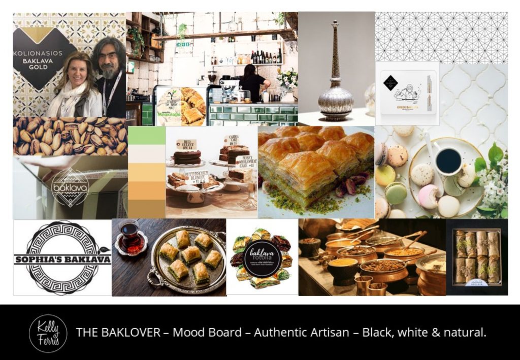
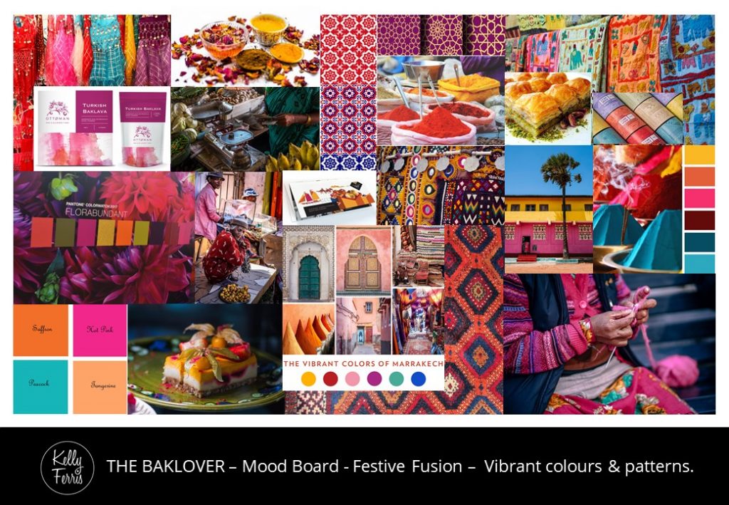
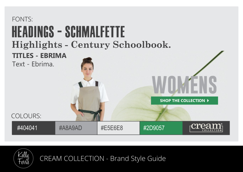
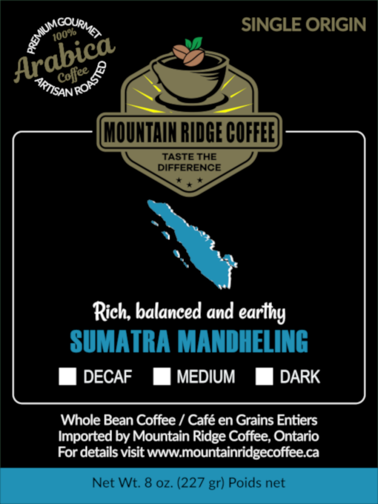
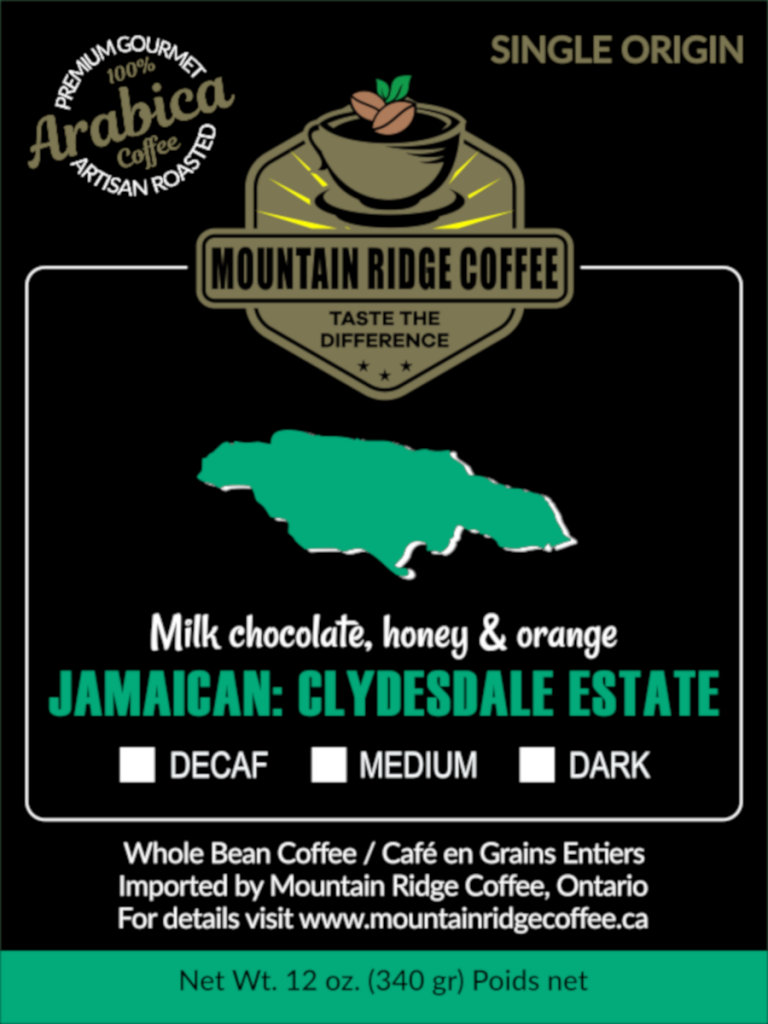
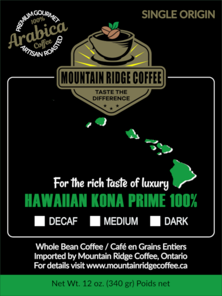
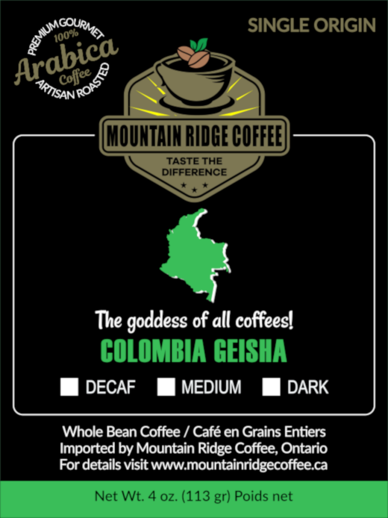
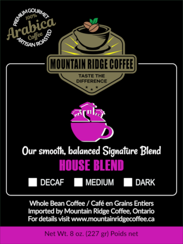
BRANDING

BRANDING

Good branding is more than just a good-looking logo.

Great branding styles use a carefully curated selection of colours, fonts, patterns and imagery to express a brand’s unique identity. A distinctive tone of voice in media copywriting also expresses the brand’s personality.
Branding style guides ensure that your brand is instantly recognisable, is consistent across all touchpoints and media platforms, and is always effective at visually telling the story of your business without having to say very much at all.

“Brands that are loud and proud always stand out in a crowd.”

KELLY FERRIS

WEB DESIGN – Cream Collection

Cream Collection Online

DESIGN BRIEF:
The team from ‘Cream Collection’ wanted to update the colours and styling of their existing website to create a more cohesive look across all of the pages.

BRANDING
GRAPHIC DESIGN
WEB DESIGN
SOCIAL MEDIA

OUTCOME:
These concepts were designed for ‘Cream Collection’ using a new balance of their existing branding style elements, with less green and more cream so that their dark grey logo and product images are the most dominant features of their site. New square images were created for the Blog and How-To pages that could easily be shared on Instagram and social media platforms with links back to the website as well.

LANDING PAGE
HOW-TO PAGE
BLOG PAGE
INSTAGRAM FEED

LOGO – Baklover Kitchen

A Logo For Baklava Lovers

DESIGN BRIEF:
After registering her business name, ‘The Baklover Kitchen’ and choosing a style direction from a selection of mood boards, Amy needed a logo. She wanted a design that looked professional and pretty to use on social media, business cards and packaging that would be displayed in cafes, restaurants, other food retailers and her market stalls.

OUTCOME:
A few different concepts were created for ‘The Baklover Kitchen’ and this concept was chosen for the final design. A range of different variations, colours and sizes were provided to suit any application, with raised gold foil layers to make the logo design look even prettier when printed.

BRANDING
LOGO DESIGN
GRAPHIC DESIGN

BRANDING – Baklover Kitchen

Brand New Beginnings

DESIGN BRIEF:
Amy needed a logo to promote her new business selling baklava to cafes, restaurants and other food retailers, as well as the general public. I had previously worked with her on the ‘Rob’s Keb-Pizza’ logo, however, this time she wanted a design that looked professional and pretty to use on social media, business cards and packaging, however, she did not know where to start. She planned to call her business ‘Baklover’ but this business name was already registered in Australia and another overseas business had registered their website using ‘baklover.com’.

OUTCOME:
Before we could begin working on her logo, Amy needed to register a business name. She was excited when I suggested using the name ‘The Baklover Kitchen’ instead and her new business was born. These mood boards were created to find a style that would suit her vision for her business and to help me create her new logo design. She loved them all but chose the Authentic Artisan mood board with a simple black, white and natural colour palette.

BRANDING
MOOD BOARDS

BRANDING – Cream Collection

Just Add Some Cream

DESIGN BRIEF:
Update existing branding style and colour palettes to refresh the look of ‘Cream Collection’ for their website, social media and other marketing materials.

BRANDING
GRAPHIC DESIGN
PHOTO EDITING

OUTCOME:
The current website for ‘Cream Collection’ is predominantly green and dark grey so these colours were retained with more cream coloured images added to suited to complement their business name. These concepts were created using their existing styling elements to strengthen their branding and to ensure their business is still instantly recognisable by their customers.

LOGOS – Galambila AMS

An Artistic Logo Remedy

DESIGN BRIEF:
‘Galambila Aboriginal Medical Service’ in Coffs Harbour, Australia had an existing logo that was beautifully designed by a local Indigenous artist. However, the white background limited use in other design applications and the small size they had was unsuitable for large-scale projects, including the billboards and TV commercials being created for ‘Ready Mob’ as part of their ‘Butt Out Kids About!’ campaign.

OUTCOME:
The existing logo design for ‘Galambila Aboriginal Medical Service’ was digitally redrawn in high-resolution using scalable vectors to prevent the small original logo from looking pixelated or blurry in large applications. The white background was also removed so we could overlay the logo on photographs and coloured backgrounds in future design projects, including the ‘Butt Out Kids About!’ campaign for ‘Ready Mob’.

LOGO DESIGN
GRAPHIC DESIGN

ORIGINAL LOGO
REWORKED LOGO

LOGO – Rob’s Keb-Pizza

A Logo With The Lot

DESIGN BRIEF:
‘Rob’s Kebabs’ in Nambucca Heads, Australia introduced pizza to their menu and needed a new logo for their new business name ‘Rob’s Keb-Pizza’. They wanted a logo that was round, predominantly black, with cartoon-like images of kebabs and pizza in a style similar to images they had seen online.

OUTCOME:
This concept was chosen for the final logo design for ‘Rob’s Keb-Pizza’ and represented the vision they had for their new logo. The logo was created in a variety of different sizes and colours to use on their shop front windows, social media and printing on their order forms, packaging and other marketing materials.

LOGO – Green Farm

Growing Green In Graphics

DESIGN BRIEF:
To create a new logo for ‘Green Farm Laboratory’ to use for marketing a new greenhouse design to investors and potential clients. The logo needed to reflect the core values of the business in a style that demonstrated the cutting-edge design and engineering of their systems which offer a new way to grow food in the future.

BRANDING
LOGO DESIGN
GRAPHIC DESIGN

OUTCOME:
This logo design for ‘Green Farm Laboratory’ was inspired by the blueprints for the greenhouse designs, the manufacturing processes involved and the universal applications for cultivating food in a sustainable and environmentally friendly way. This logo was created in a variety of colours to allow the logo to be used on different coloured backgrounds and to overlay on photograph images.

PACKAGING – Mountain Ridge Coffee

The Pinnacle Of Artisan Coffee

DESIGN BRIEF:
Your labels for ‘Black Opium Coffee’ were amazing and I was looking for something similar for my coffee line of products at ‘Mountain Ridge Coffee’. I have 24 different coffees – 10 single origin 6 blends and 8 flavours. All of which can be created using 5 different colours (3 for my Single Origins, 1 for Blends and 1 for flavours).

PRODUCT PACKAGING
GRAPHIC DESIGN
ICONS & INFOGRAPHICS

OUTCOME:
These labels may have been inspired by my previous ‘Black Opium Coffee’ concepts, however, the final designs are a more distinctive reflection of the vibrant, earthy, artisan and premium quality that is unique to the ‘Mountain Ridge Coffee’ brand. Each label was created with its own colour, description and graphics to distinguish between each of the individual coffee products, using 5 different colour palettes to unify the flavours (oranges, browns and reds), blends (pinks and purples) and single origin collections (Asia/blues, Africa/Yellows, and America/Greens).